
A UX Case study
A 2018 Case Study pertaining to work during my 10+ year tenure as a UX Professional at Vertiv (formerly Emerson Network Power).
All information in this case study is my own and does not necessarily reflect the views of Vertiv.

In 2017 we were tasked with designing a mobile application that would allow users to monitor devices on the cloud. At the end of Q1 in 2018 the business decided the app should no longer be a monitoring app, but rather a portal providing visibility into Vertiv Service Execution.
The Challenge
The biggest problem to be solved with this project was that the goals of the user changed. We became less concerned with alerts and notifications, and more focused on communicating what service was being provided for customers with service contracts since they pay Vertiv to maintain equipment and resolve issues for them.
UX Research

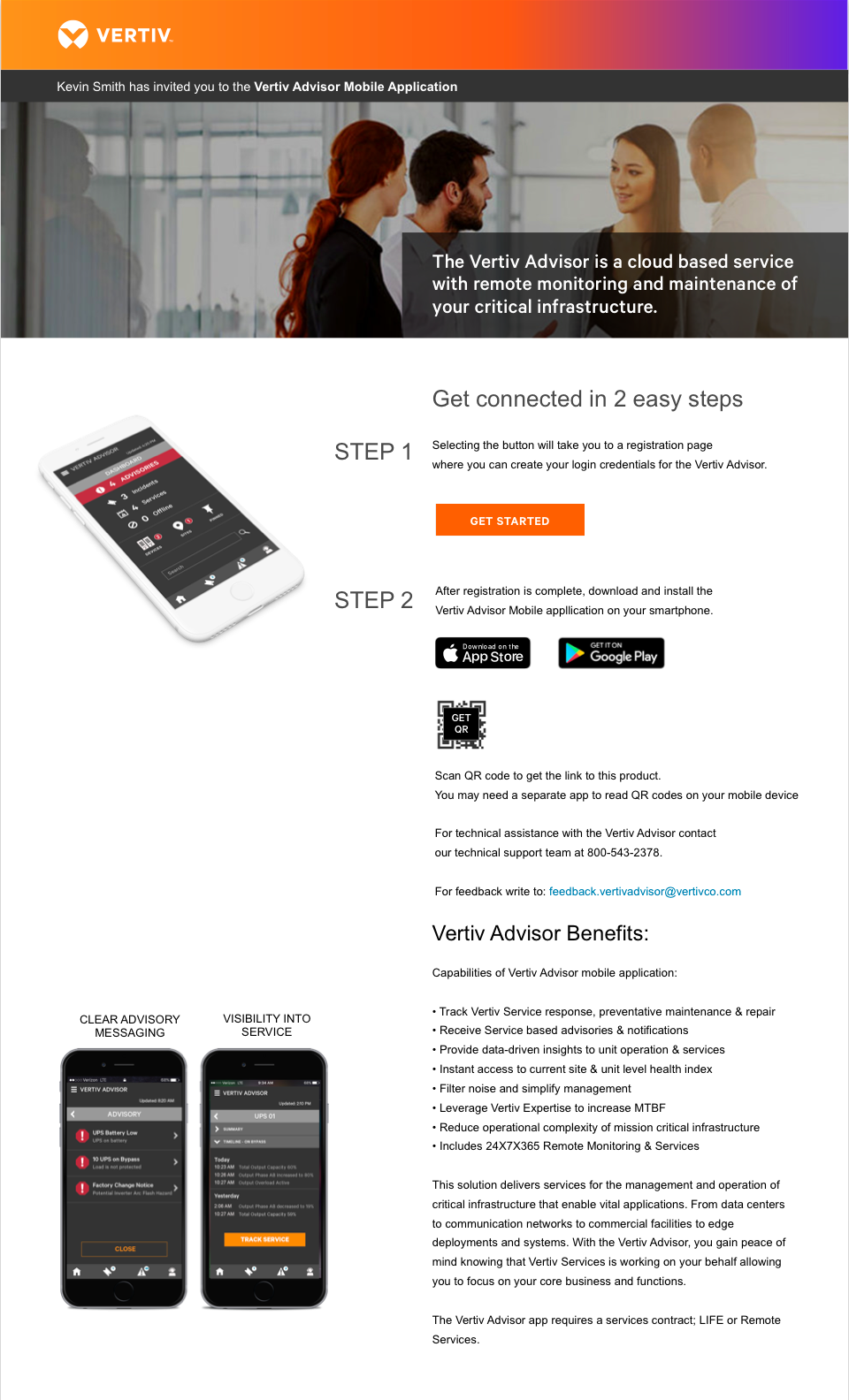
High Level Goals
- Bring customer attention to what’s important
- Filter Noise
- Simplify management
- Build trust
- Transparency into service execution
- Never display data to the customer without thinking about it
My Role
I managed and was the lead designer on this project. We built the first iteration of this prototype using Adobe Illustrator and Adobe XD, which we learned as we implemented it. I wanted to update our processes to increase efficiency, so while we were working on this project we switched to using Sketch and UX Pin for rapid prototyping. So we were learning how to use the software, and building a new design system concurrently while we were adhering to new processes.
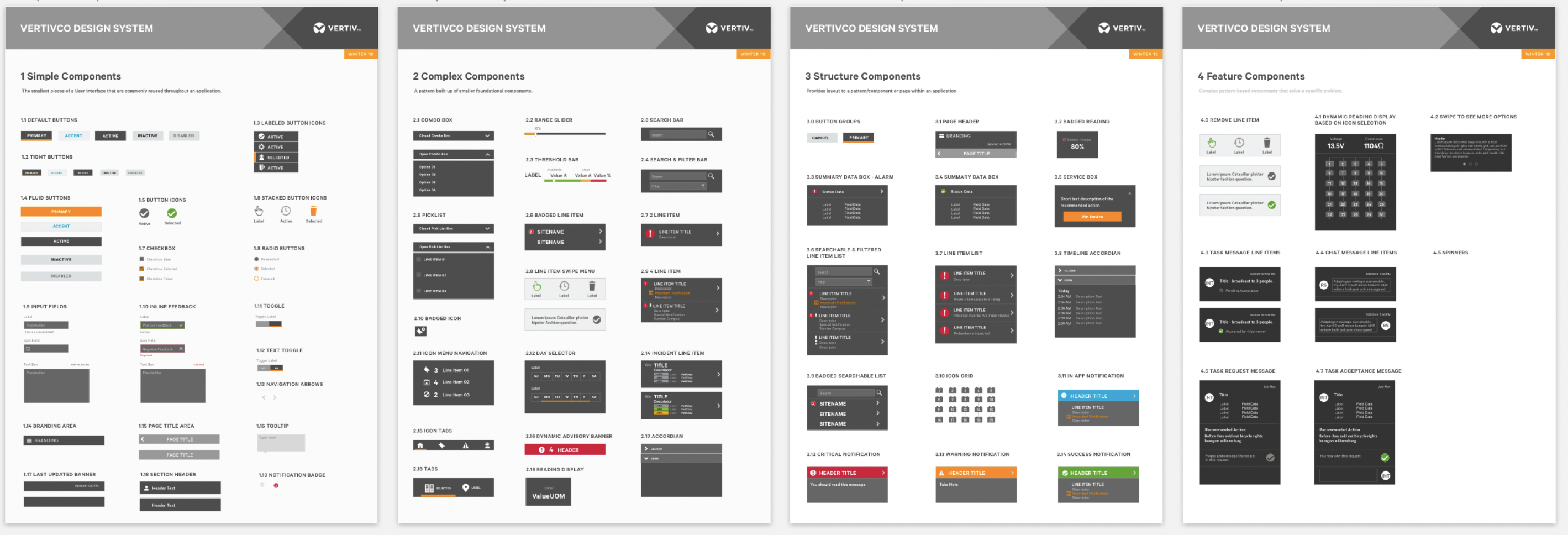
First iteration of the Design System of UI components for the Mobile Application.
I collaborated with a UX Researcher, the project Stakeholder, and the Engineering team. The Vertiv Advisor mobile application launched in the Google Play Store, and the Apple store in Nov. of 2018.
ux research summary
months of research
Research Sessions
Customers involved
datapoints collected
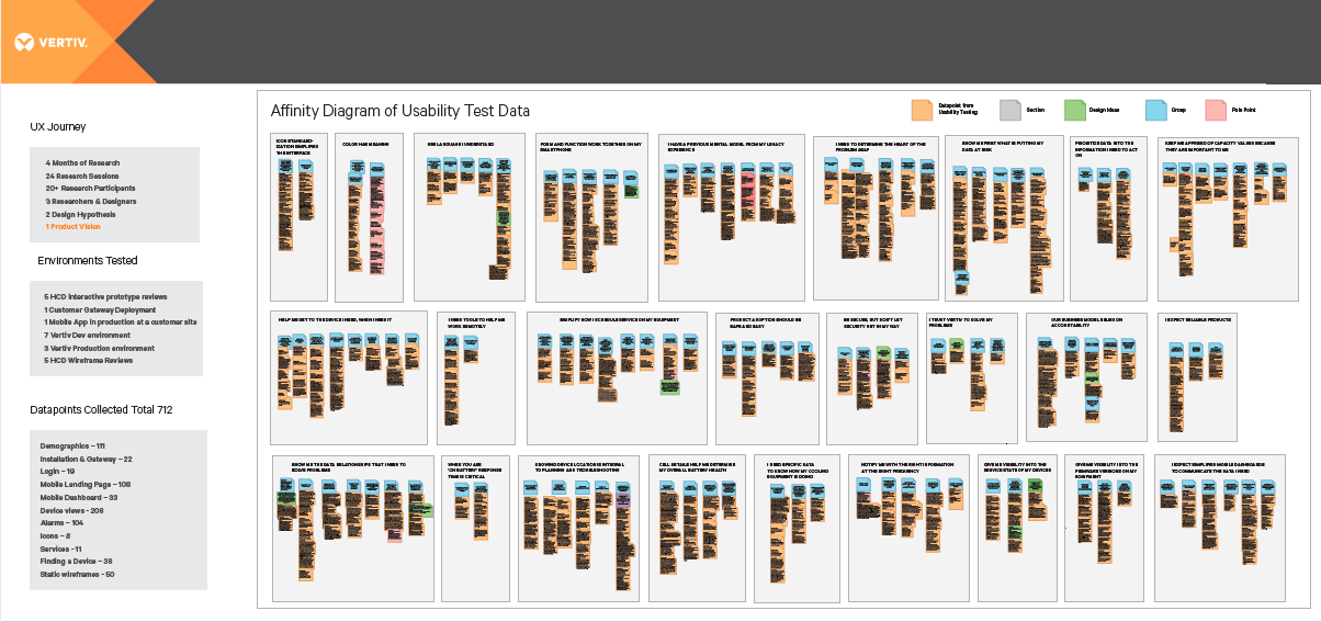
The team collected 712 datapoints from potential users via usability testing. One of the challenges that the team faced, was that we were all located in different states. In the past we used to affinity diagrams in person with post-it notes. But this time, we discovered that we could create an affinity diagram remotely by importing the data into virtual post-it notes in Lucid Chart. This was a huge discovery and it drastically reduced the time it took to create the affinity diagram and it didn’t require us to travel.
The Data Speaks
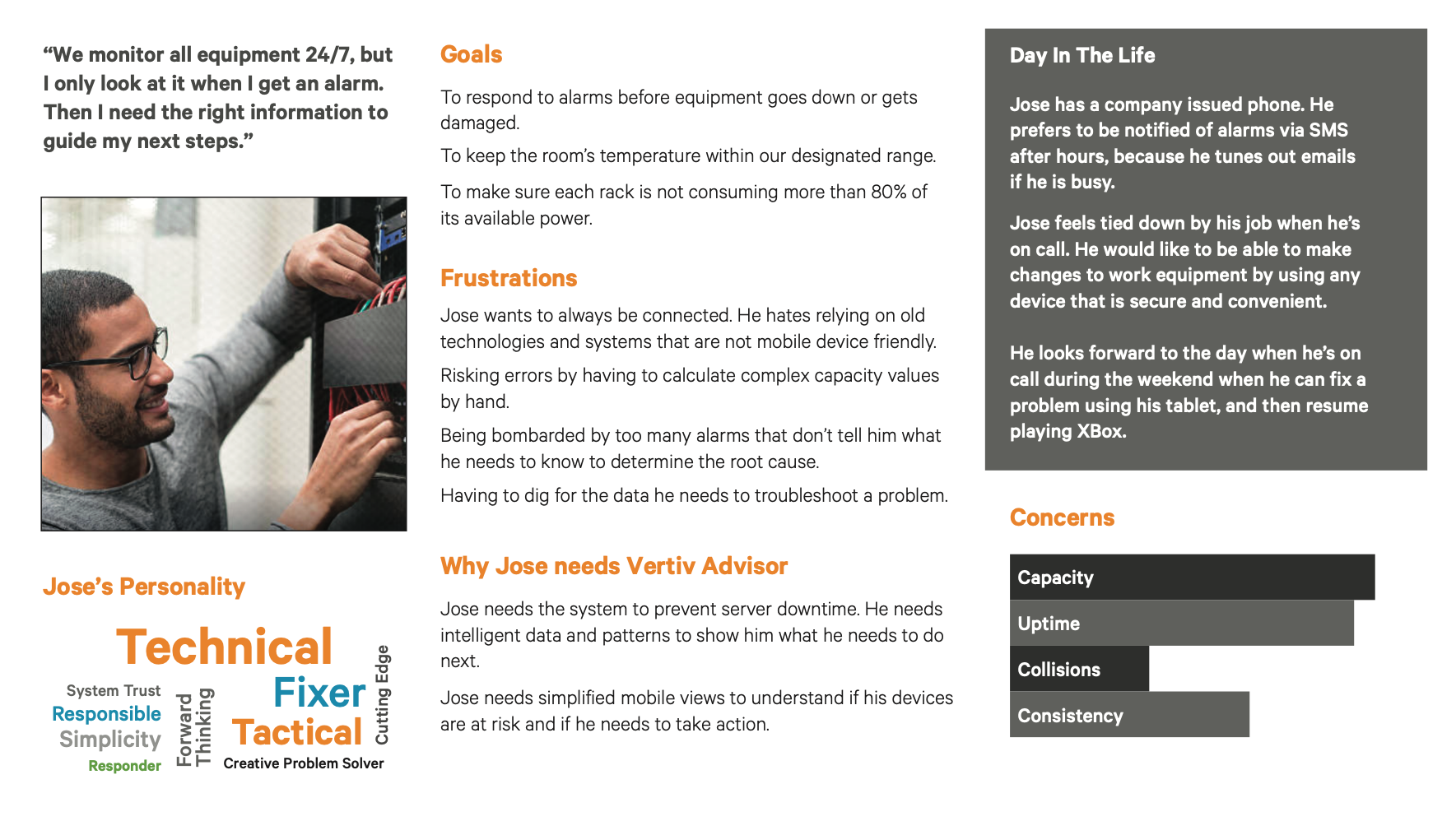
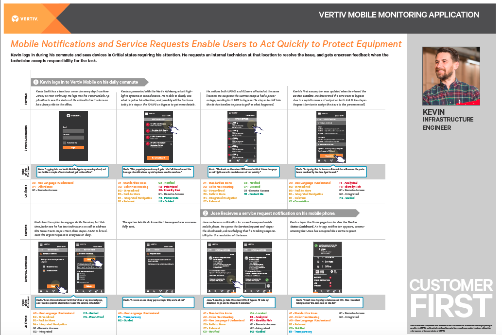
Once we had user data, we were able to create Personas, and Storyboards that aligned to the insights based on research.
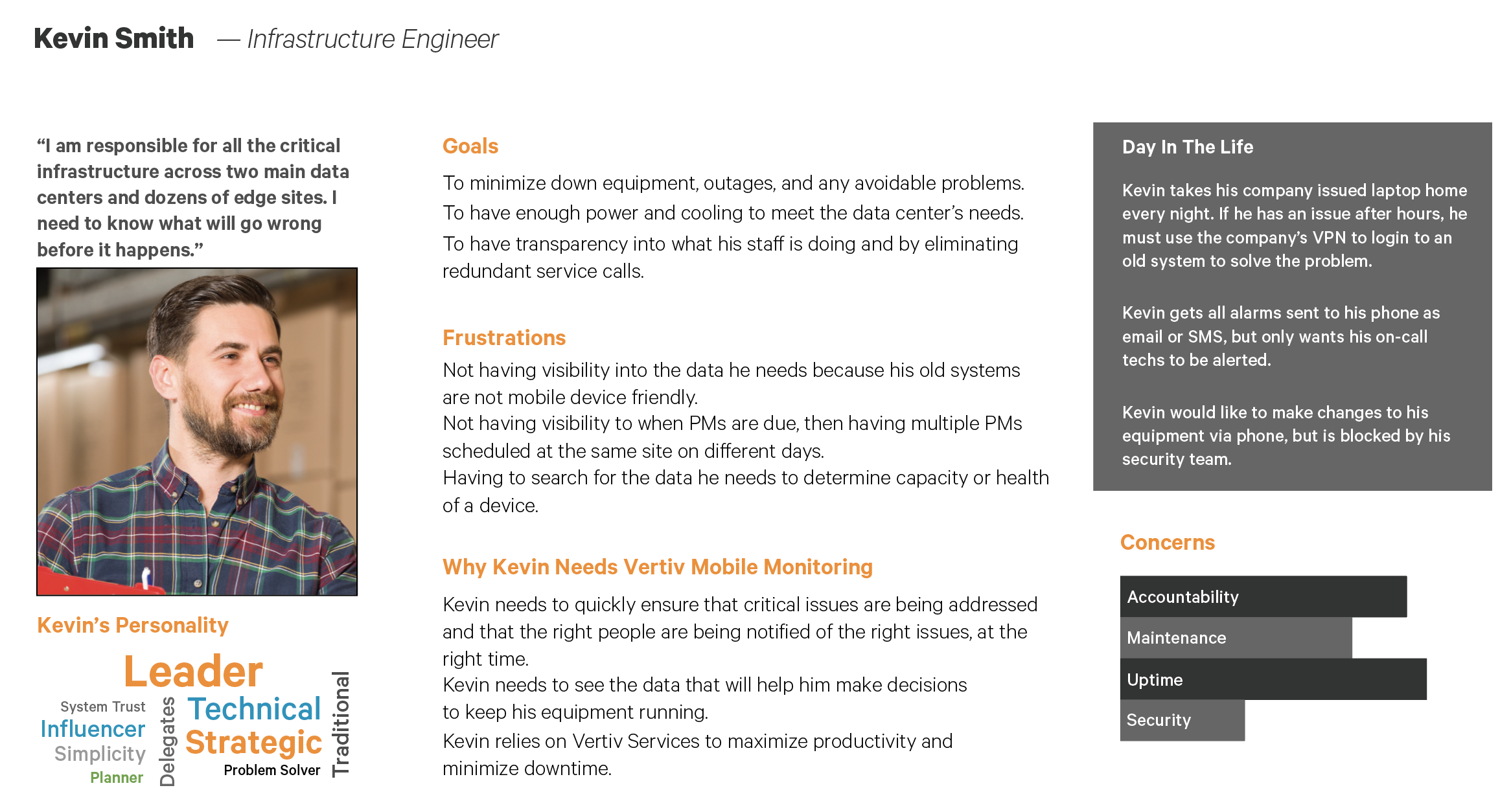
Give the Data Meaning
We created two initial user personas, two that represented customers, and then later we added two that represented Vertiv Remote Service employees that would interact with the customers. Then we wrote storyboards that starred the personas as the main character, and showed how they would use the application. We included the Voice of the Customer to illustrate the product value and to build empathy with the user.
UX Architecture
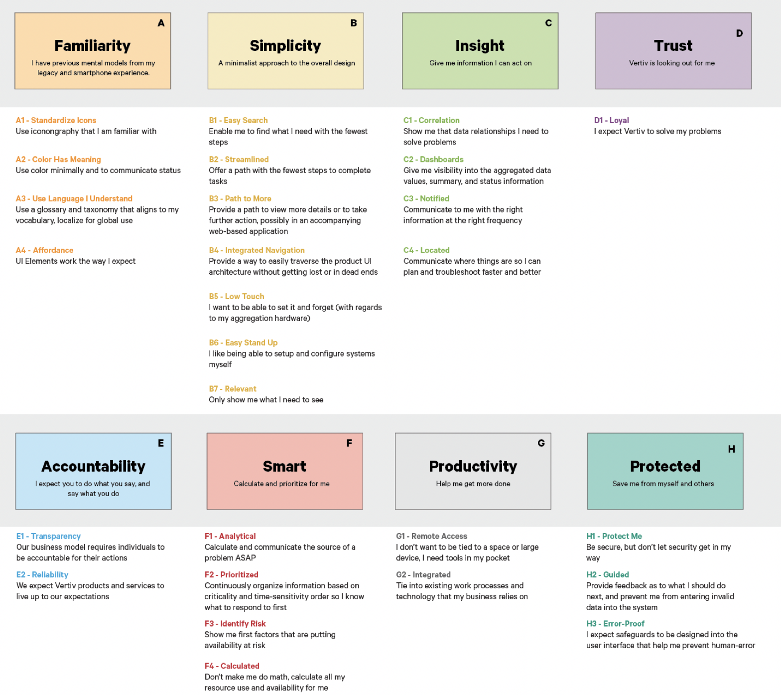
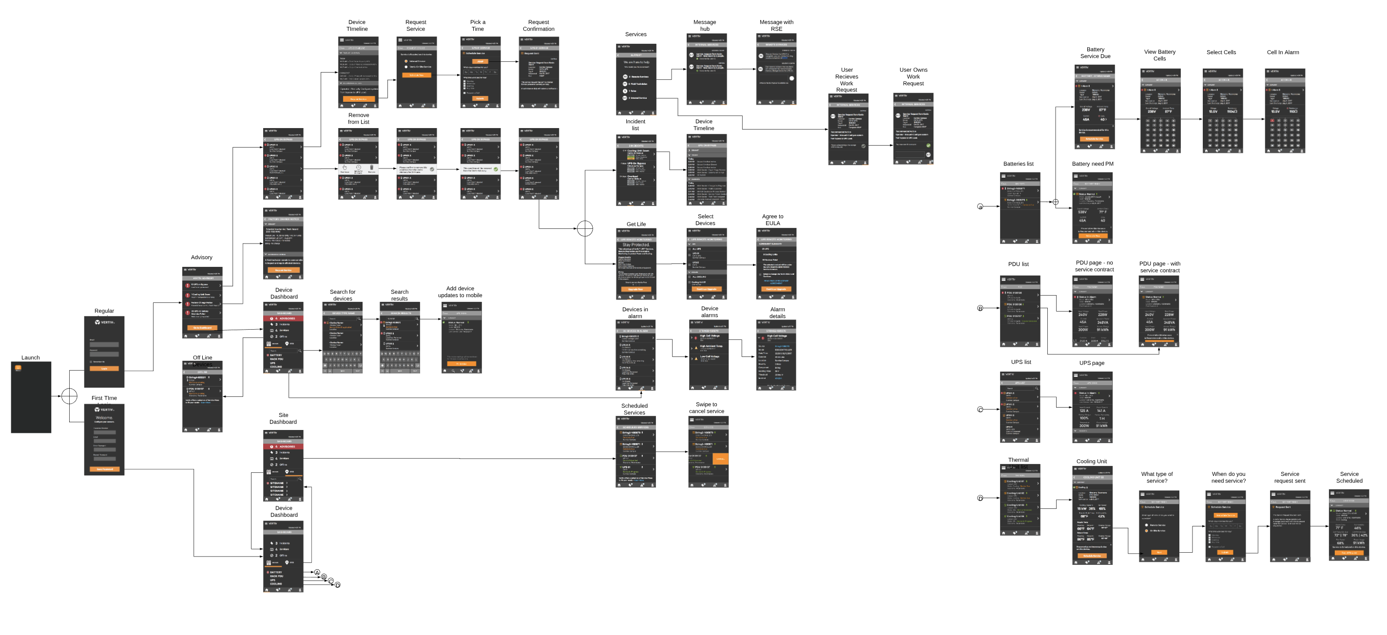
It was time to put together some artifacts for engineering so they would be able to build the application. This included UX Elements and Themes that were used to build a common UX vocabulary and to trace the storyboard data to the product requirements. We also provided interaction maps so they could have a holistic view of the expected interaction points.
By involving our users, we discovered business opportunities in every step of the design process. We provided new pathways in the mobile application to up-sell and cross-sell. All of these opportunities could be viewed in an interaction design map that engineering could use to determine what pages linked to what.
We produced a Product Vision for the Mobile application that included design ideas from the hive intelligence of the team and our users. The Product Vision built alignment and clarity across the team by communicating who we were designing for, how they were going to use it, and what was the value we were delivering.
integrating with the business

We socialized a Product Vision for the Mobile application that included design ideas from the hive intelligence of the team and our users. The Product Vision built alignment and clarity across the team by communicating who we were designing for, how they were going to use it, and what was the value we were delivering.
The Ecosystem
The Vertiv Advisor mobile app was designed to share data with the Remote Service teams’ Service tool applications, and to eventually be integrated with the Vertiv.com website as a Customer Portal. In turn, users will be able to go to the Vertiv.com web site, and request service, that would then be visible on the schedule in their mobile application.

We are continuing to make improvements to the entire Vertiv Digital Ecosystem so that we can provide the best experience for our users. We want their experience to exceed their expectations and build Vertiv Brand equity, at every customer touchpoint.
Recent Comments